Now that I have an idea for my poster, today I have started to create it. Here are the steps I took which lead me to the end product.
1. Firstly I opened up the Photoshop programme on my computer.
2. Secondly I searched for images on the internet which I thought would be appropriate to use. I was aware that the image for my final poster has to be original however I thought using one from the internet to start with would give me an idea of the type of primary image I wanted to take myself. I considered quite a few images but eventually it came down to between two which you can see below;
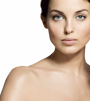

In the end, I ended up choosing the image situated on the left due to the fact it was better quality and did not appear blurred when made into a larger size.
3. Next, I tried putting the image in various places on the A4 document to see were it was best to be placed. Eventually I found a position which I thought was effective.
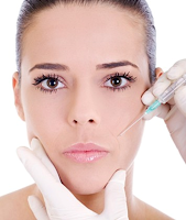
4. I then began editing the ladies face. I did this by putting platic surgery markings on her face, by making her lips fuller with a very light pink colour which made them look unnatural and by editing her eyes so they were a different colour, which again made her features look unnatural. Obviously beause she was already photoshopped by professionals, I didn't have to make any changes to her skin as she did not have any prominant blemishes.
5. After this I decided to create the background for the poster. This is where my idea changed slightly. One of my friends is an Art Multi Media student and i'd recently seen him use a certain technique for his work which I decided would be good to use for my poster. The technique is simple and costs next to nothing to do, plus is not very time consuming. It involves cutting out text from a newspaper, wripping it up and sticking it down randomly on a piece of A4 paper. Then, I printed out a few main headlines about the topic which my Film is based on - Body image. It creates an affect that all the text is to do with the topic of body image, when actually only the 4 headlines are. I thought this was really good to use, as it demonstrates just how influential the media is when it comes to appearances. He is the prototype I created below;

 I then scanned this into the computer, which enabled me to open it in Photoshop. I then situated the image behind the model and experimented with the colour of it. I decided to keep the colour black and white becaus this is typical of Newspaper text and I felt the contrast between the black and white text combined with the the models dark skin, pale lips and bright eyes really made the model stand out.
6. The only thing left to do now was the title/date of release. When I researched film posters I found a lof of the titles were at the bottom of the A4 paper, therefore I decided to follow this trademark idea. It also worked well for two reasons. One of these was as the background was the newspaper this was already filled with text, so having text on top of text looked odd and the public may've not been able to read the text clearly. Secondly, the bottom of the poster looked a bit bare, and her the woman had space for the title/date to be on her shoulders. This could act as a metaphore as though it is engraved on her skin. I decided to make the title of the film considerably bigger compared to the release date - something else which is often seen on film posters and I then experimented with different colours, to see which colours worked well with the design. Getting this right was quite difficult as the colours appeared differently in the programme compared to how they did once they'd been printed.
7. After compiling all these factors I then had a poster which I was happy with. Below is the end result of my first draft;

No comments:
Post a Comment